What Colours Go With a Cashmere Kitchen?
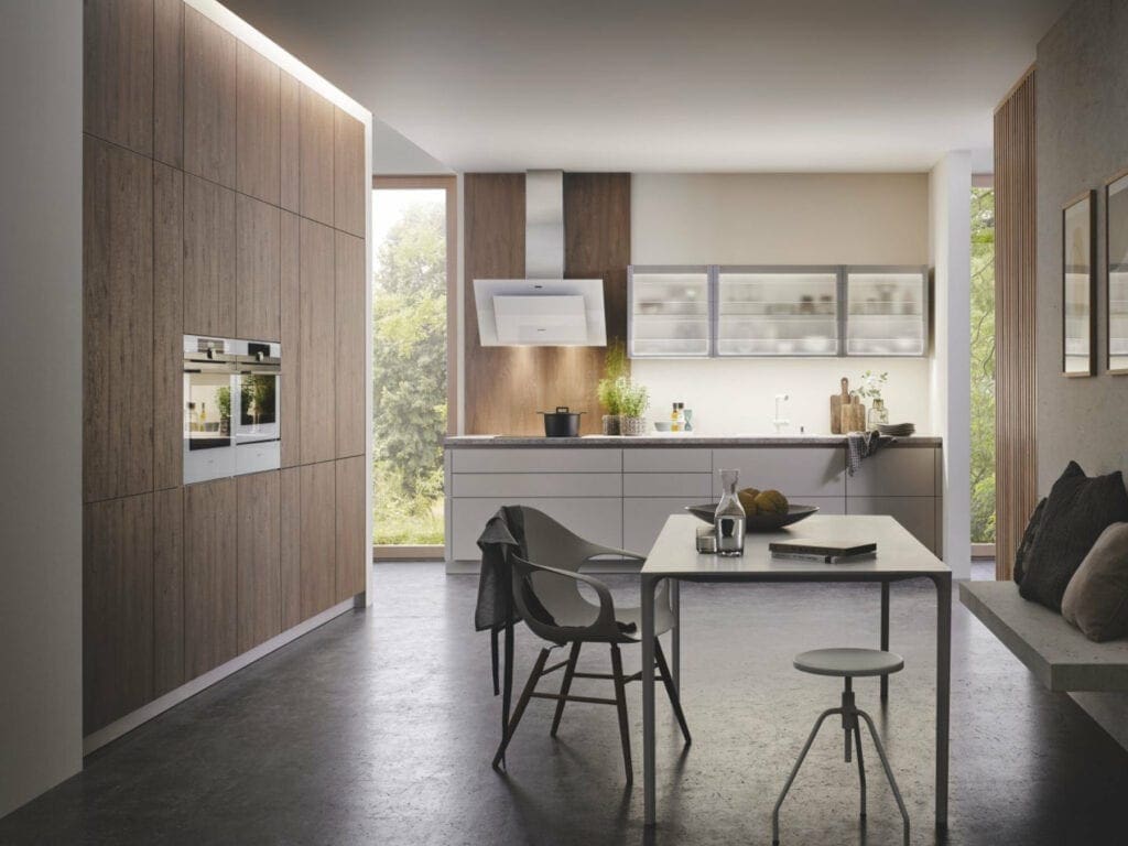
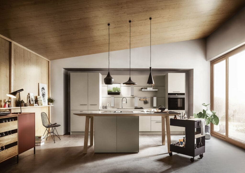
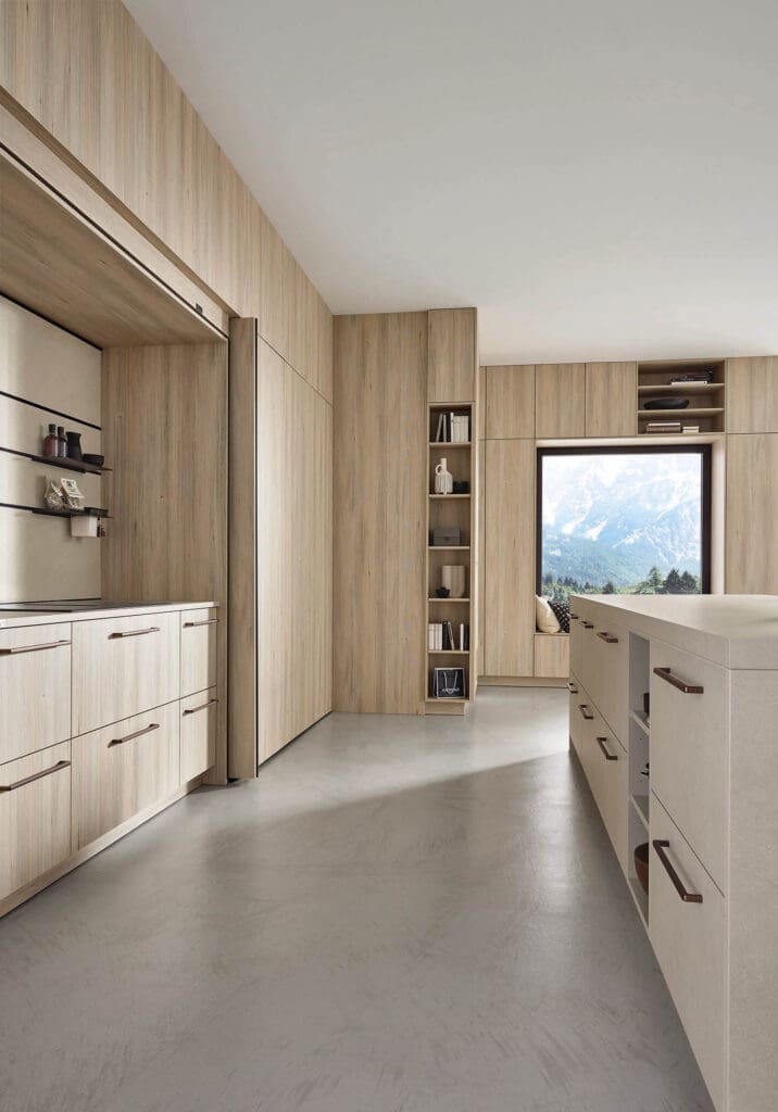
Cashmere kitchens have become one of the most popular neutral kitchen colour choices in recent years. Sitting between beige and grey, cashmere offers a warm, balanced tone that works across a wide range of interior styles — from modern handleless kitchens to classic shaker designs.
One reason cashmere cabinetry has become so widely chosen is its versatility. Unlike cooler greys or stark white kitchens, cashmere provides a softer, more natural backdrop that pairs easily with different materials, worktops and wall colours.
For homeowners planning a kitchen update, one of the most common questions is what colours work best alongside cashmere cabinets. Because cashmere sits comfortably within the neutral colour spectrum, it allows you to introduce both subtle and contrasting tones without overwhelming the space.
This guide explains which colours work best with cashmere colour kitchens, including wall colours, worktops, splashbacks and design combinations that help create a balanced and timeless kitchen.
What Colour is a Cashmere Kitchen?
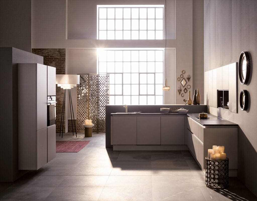
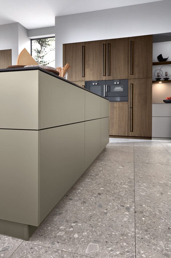
A cashmere colour kitchen refers to cabinetry finished in a warm neutral shade that blends beige, taupe and soft grey tones.
The colour takes its name from cashmere wool, known for its subtle warmth and understated elegance. In kitchen design, this shade offers a middle ground between traditional cream kitchens and cooler modern greys. Because cashmere contains both warm and cool undertones, it works comfortably with a wide range of colours and materials.
Why Cashmere Kitchens are Popular
Cashmere cabinetry has gained popularity because it offers:
- A neutral tone that avoids stark white or dark colours
- A warmer alternative to grey kitchens
- Compatibility with natural materials like wood and stone
- A timeless appearance that suits both modern and classic kitchen designs
This balance makes cashmere an adaptable colour that can work in everything from contemporary handleless kitchens to more traditional shaker styles.
What Colours Go with a Cashmere Kitchen?
When looking at complementary cashmere kitchen colour ideas, the aim is usually to either enhance the warmth of the colour or introduce gentle contrast.
Some of the most successful colour pairings include:
Soft greys
Soft grey tones work particularly well with cashmere because both colours sit within a neutral palette. Pale greys maintain a calm, contemporary atmosphere without competing visually with the cabinetry.
Grey often appears in:
- wall colours
- worktops
- flooring
- splashbacks
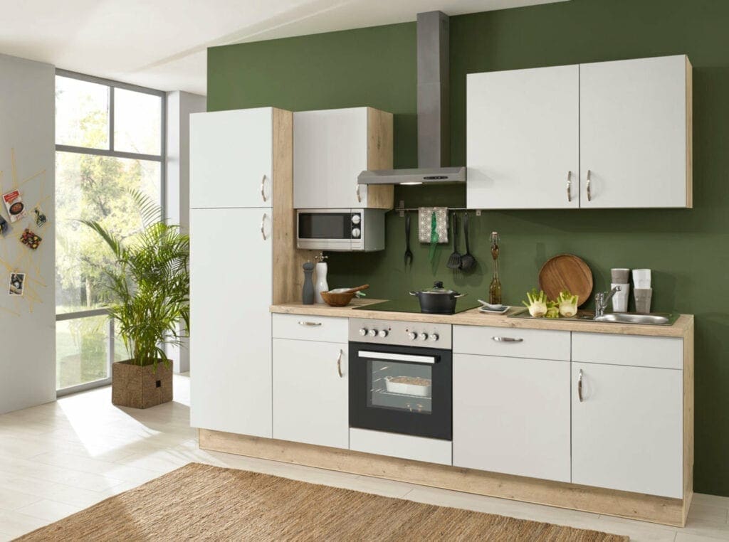
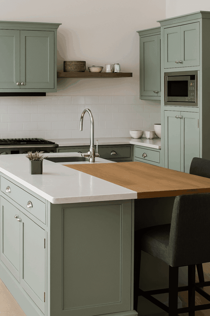
Earthy greens
Muted green shades such as sage, olive or moss pair naturally with cashmere because both colours share warm undertones.
This combination is often used to create kitchens with a more natural or relaxed feel.
Green can be introduced through:
- painted walls
- tiled splashbacks
- accessories or decorative elements
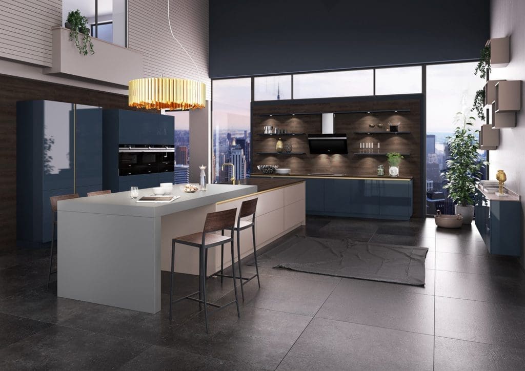
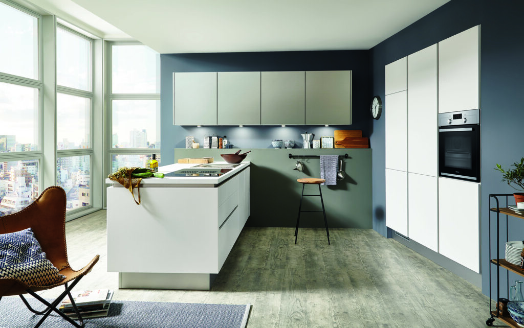
Muted blues
Dusty blues or muted navy tones can introduce contrast while still maintaining a balanced palette.
Blue accents often appear in:
- feature walls
- splashbacks
- kitchen islands in two-tone kitchens
Warm whites
Soft white tones help brighten the space while maintaining the neutral warmth of cashmere cabinetry.
Warm whites tend to work better than cooler whites, which can sometimes make cashmere appear dull by comparison.
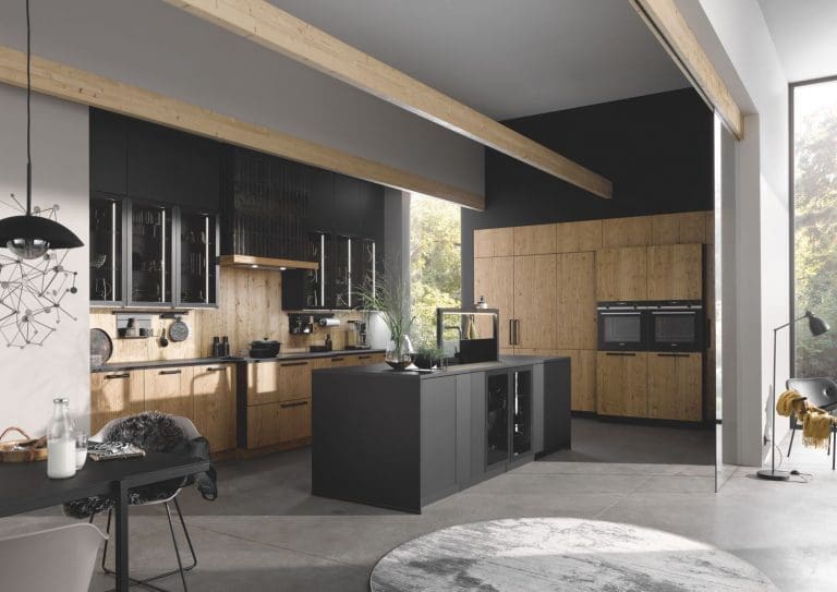
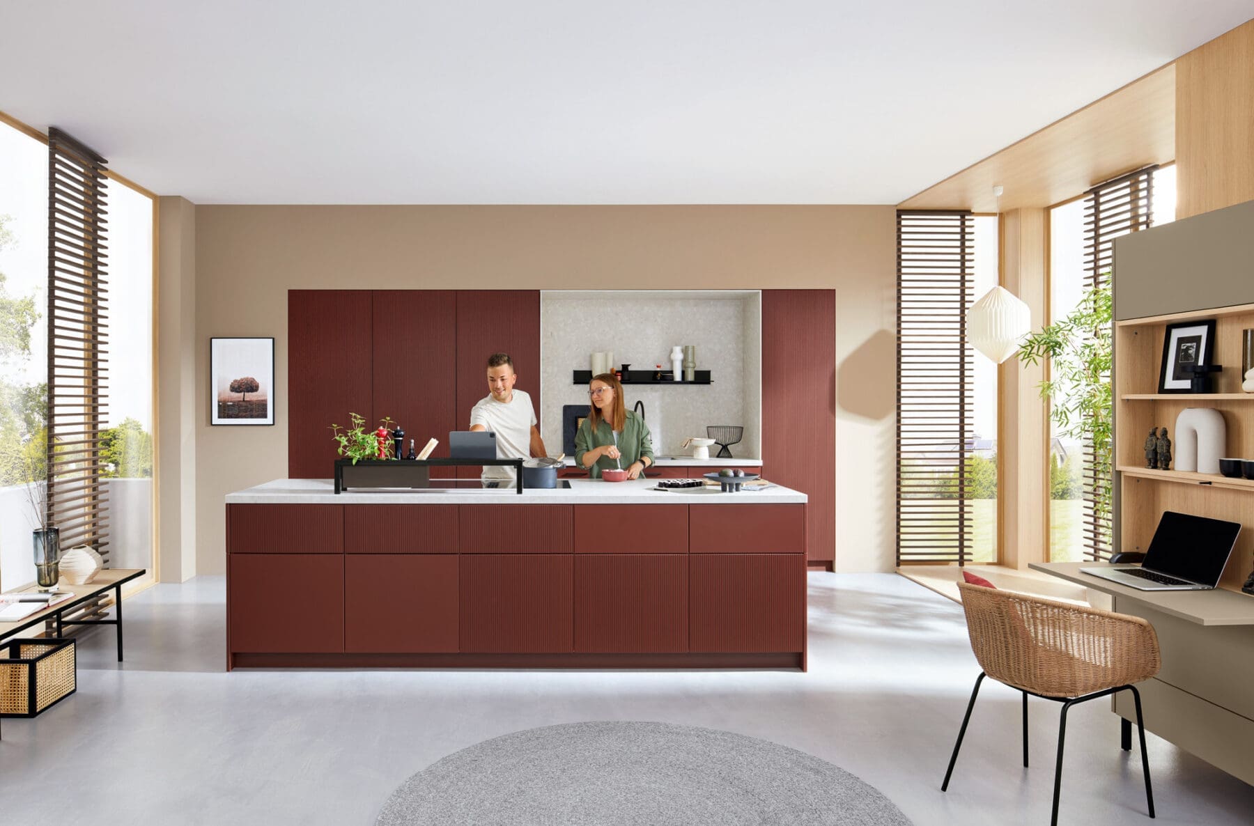
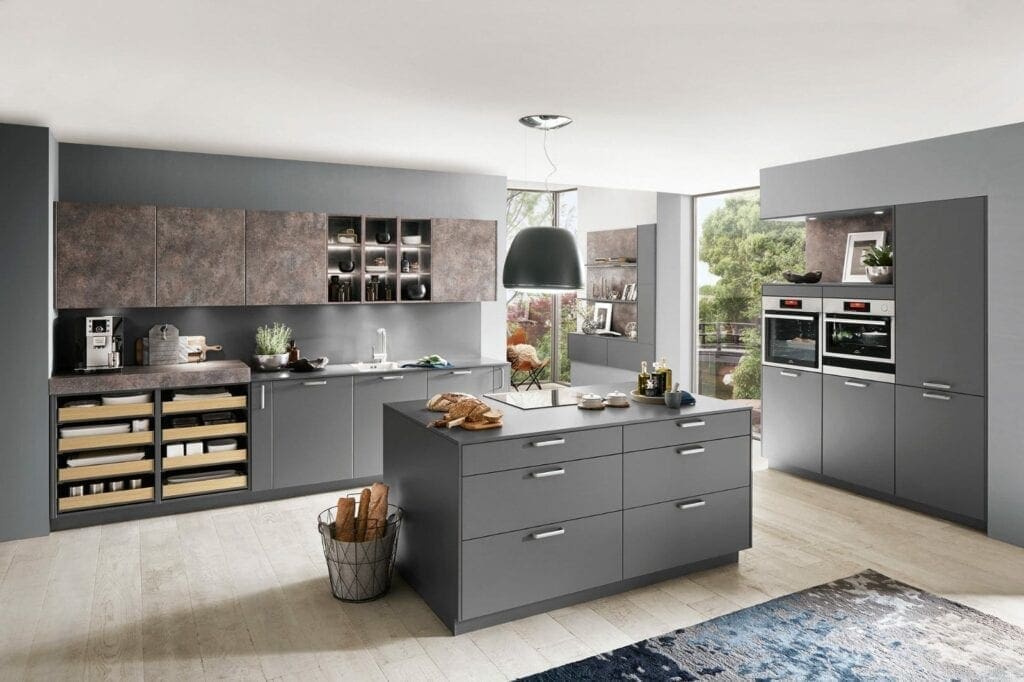
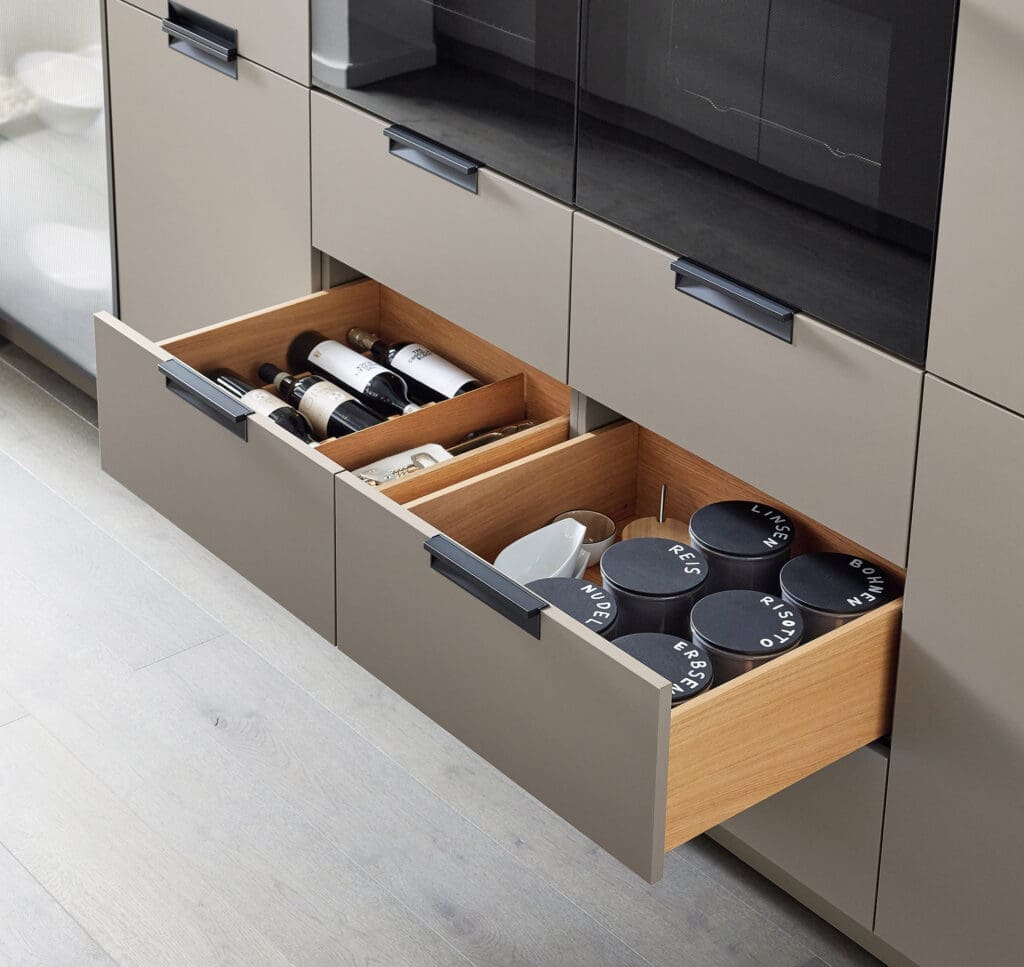
Dark accent colours
Darker colours can also be used sparingly to add depth to the design.
Popular choices include:
- navy blue
- charcoal grey
- deep forest green
These tones are often used for kitchen islands or lower cabinets in two-tone kitchens.
Cashmere Kitchen Colour Pairing Chart
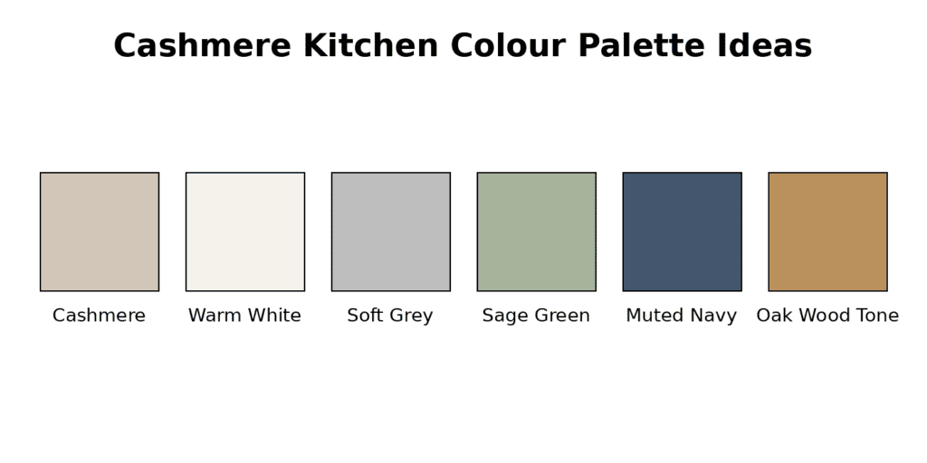
The chart below highlights some of the most common colour combinations used alongside cashmere kitchen units.
| Colour | Where It Works Best | Design Effect |
| Warm white | Walls, splashbacks | Bright and clean |
| Soft grey | Walls, worktops | Contemporary and calm |
| Sage green | Walls, splashbacks | Natural and relaxed |
| Navy blue | Islands, accent cabinets | Strong contrast |
| Taupe | Walls, flooring | Subtle neutral layering |
| Oak or wood tones | Worktops, flooring | Warm and textured |
These combinations allow the kitchen to remain balanced while introducing visual interest.
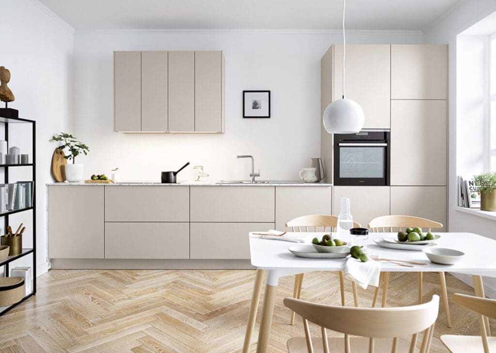
What Colours Work for Cashmere Kitchen Walls?
Kitchen wall colours play a major role in how cashmere cabinetry appears in the room. Because walls cover a large visual area, they influence whether the space feels warm, cool, bright or muted.
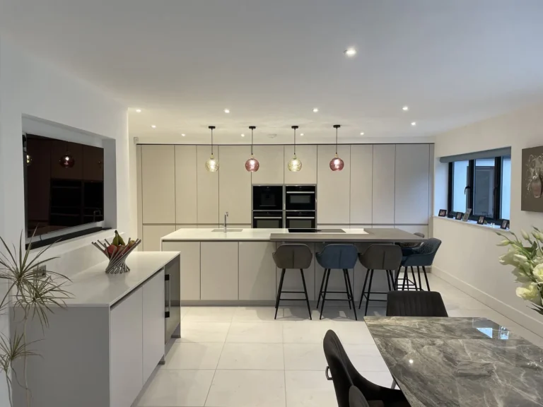
Warm white walls
Warm white paint colours are one of the safest choices for a cashmere kitchen walls.
They help:
- brighten the room
- keep the palette neutral
- allow cabinetry to remain the focal point
Avoid stark whites, which can sometimes clash with the softer tone of cashmere.
Light grey walls
Light grey walls create a slightly more contemporary look while maintaining a calm colour palette.
This approach works particularly well in modern kitchens with:
- handleless cabinetry
- stainless steel appliances
- minimalist design

Sage green walls
Sage green walls can introduce subtle colour while still maintaining a relaxed atmosphere.
This pairing works especially well with:
- wooden worktops
- brass handles
- natural stone surfaces
Pale blue walls
For kitchens that need a little more colour, pale blues can create a soft contrast against cashmere cabinetry.
These shades are often used in traditional or shaker style kitchens.
What Colours Go with Cashmere Kitchen Worktops?
Worktops are one of the most visually prominent elements in any kitchen, making them an important design choice.
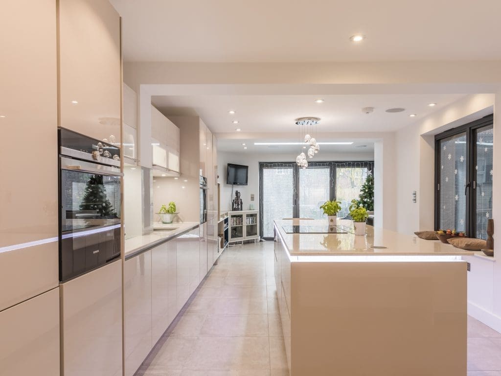
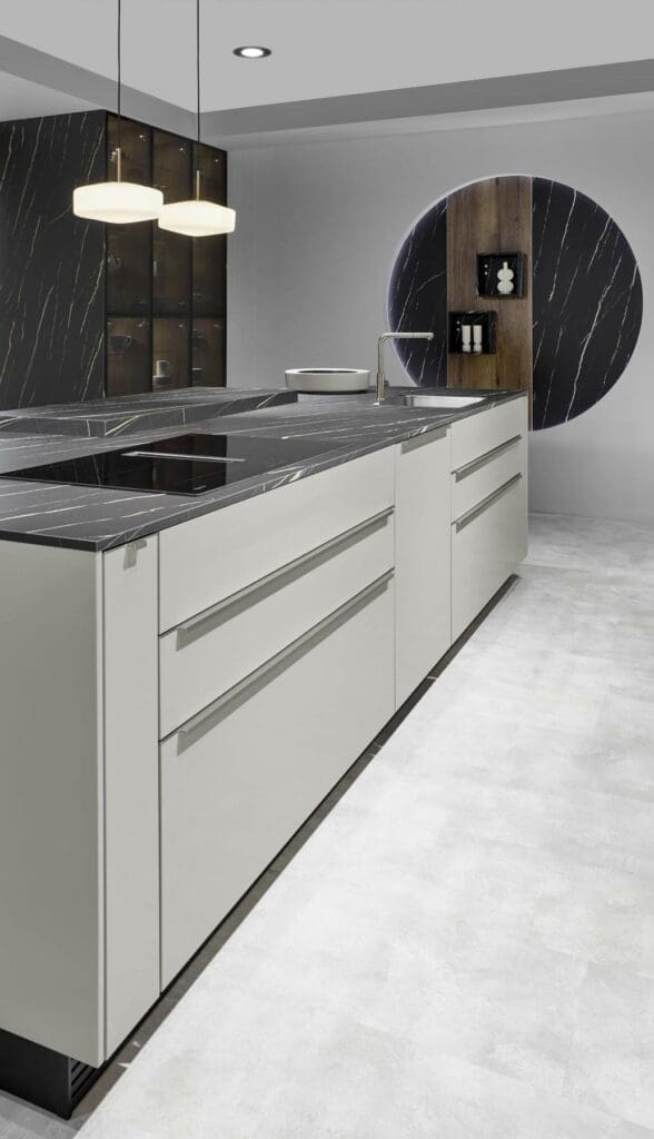
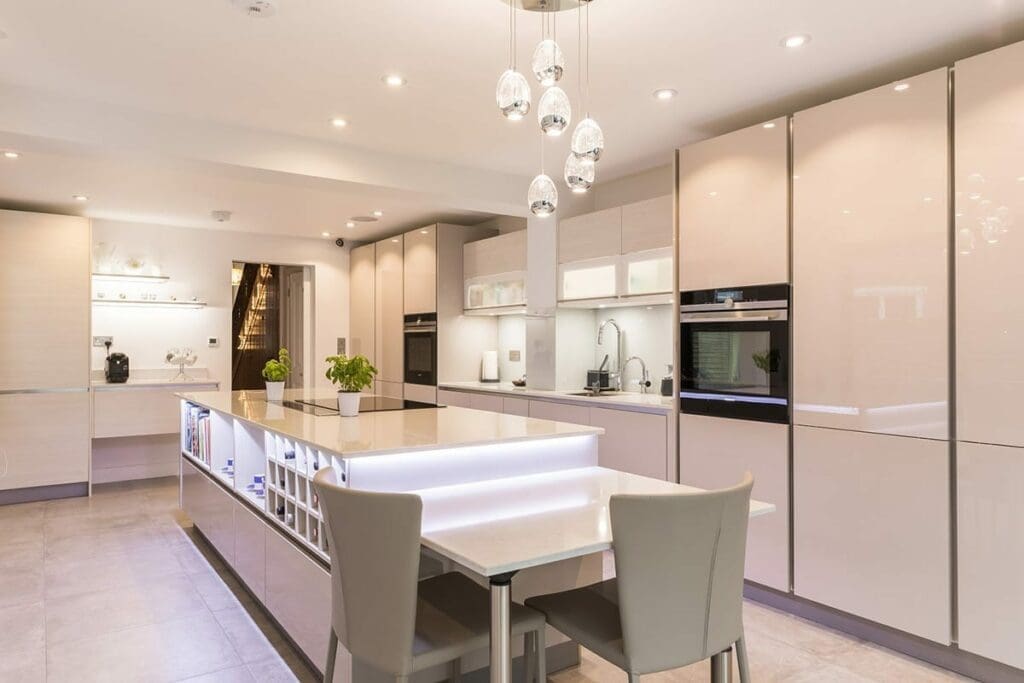
White quartz or marble
White worktops remain one of the most popular choices for cashmere kitchens.
They offer:
- strong contrast
- a bright surface that reflects light
- a modern, clean appearance
Quartz surfaces with subtle marble veining are particularly common.
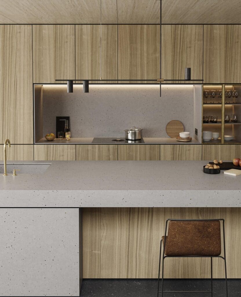
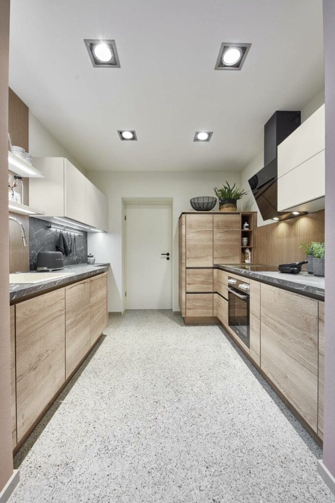
Wooden worktops
Wood introduces warmth and natural texture that complements the soft tone of cashmere cabinets.
Popular wood options for cashmere kitchen worktops include:
- oak
- walnut
- butcher block surfaces
This combination is often used in kitchens aiming for a Scandinavian or natural aesthetic
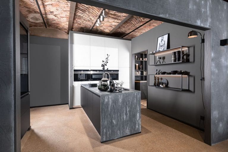
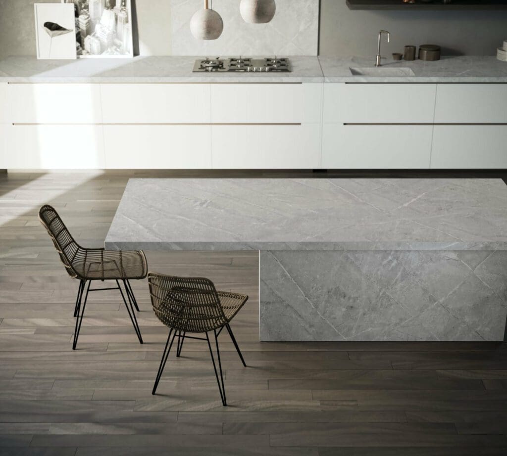
Grey stone worktops
Mid-grey worktops can help create a balanced modern look when paired with cashmere cabinetry.
This option works particularly well in kitchens with grey flooring or stainless steel appliances.
Dark worktops
Dark surfaces such as charcoal quartz or black granite create a dramatic contrast with cashmere units.
However, when considering cashmere kitchen colour ideas, darker worktops are usually most effective in kitchens with good lighting to prevent the space feeling heavy.
What Colour Splashback Goes With a Cashmere Kitchen?
Splashbacks provide an opportunity to introduce pattern, texture or colour without overwhelming the overall design.
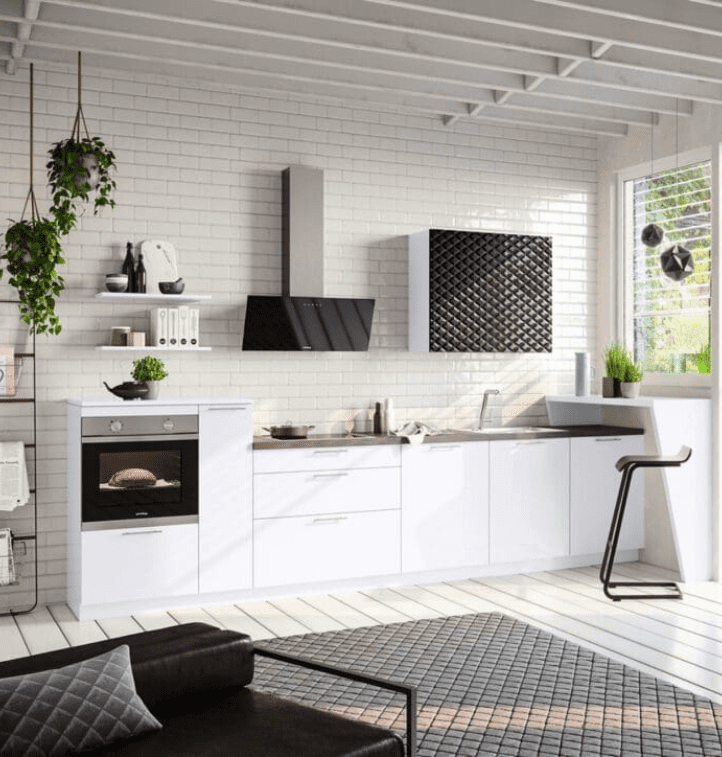
White metro tiles
Classic white subway tiles remain a popular splashback choice because they:
- keep the kitchen bright
- introduce subtle texture
- suit both modern and traditional kitchens
Layouts such as herringbone or vertical stacking can add visual interest.
Glass splashbacks
Glass splashbacks allow colour to be introduced to cashmere colour kitchens in a subtle way.
Popular colours include:
- pale green
- soft grey
- muted blue
These colours can gently contrast with cashmere cabinetry.
Stone splashbacks
Using the same material as the worktop creates a seamless modern look.
This approach is common in contemporary kitchens with large islands or slab worktops.
Cashmere Kitchen Design Ideas
Cashmere kitchens can work across a wide range of design styles depending on the materials and colours used alongside them.
Two-tone kitchens
Two-tone kitchens are a popular design choice when using cashmere cabinetry.
Common combinations include:
- cashmere and navy
- cashmere and graphite grey
- cashmere and dark green
Often the darker colour is used on base cabinets or the kitchen island.
Natural textures
Natural materials help add depth and warmth to a cashmere kitchen.
Examples include:
- wooden flooring
- stone worktops
- open wooden shelving
These textures prevent the kitchen from feeling too uniform.
Metallic finishes
Metal accents can subtly influence the overall tone of the kitchen.
- brass and copper create warmth
- chrome and stainless steel create a cooler modern feel
- black handles add contrast
Common Cashmere Kitchen Design Mistakes
Although cashmere is a flexible colour, a few design choices can make the kitchen feel unbalanced.
- Using very cool whites
Bright blue-toned whites can clash with cashmere’s warmth. - Too many dark surfaces
Combining dark worktops, flooring and splashbacks can make the space feel heavy. - Ignoring lighting
Cashmere can appear slightly different depending on lighting conditions, so natural and artificial lighting should always be considered.
Why Cashmere Kitchens Remain Popular
Cashmere kitchen colour ideas continue to appeal to homeowners because they combine the best qualities of both traditional and contemporary kitchen colours. They offer:
- warmth without being too yellow
- neutrality without feeling cold
- versatility with different materials and finishes
Because of this balance, cashmere remains a colour that works well across many kitchen styles and layouts.
FAQs
What colour worktop works best with a cashmere kitchen?
White quartz, marble-effect surfaces and wooden worktops are among the most popular options because they complement cashmere’s warm neutral tone.
Are cashmere kitchens still in style?
Yes. Cashmere remains a widely chosen kitchen colour because it offers a timeless neutral look that works with many interior styles.
Do grey worktops work with cashmere kitchens?
Yes. Mid-grey worktops can create a contemporary look while maintaining a balanced colour palette.
What splashback colour works best with cashmere cabinets?
White tiles, marble-effect splashbacks and muted colours like sage green or pale blue all pair well with cashmere kitchens.
Is cashmere a warm or cool colour?
Cashmere is considered a warm neutral because it contains beige undertones alongside soft grey.
What colours contrast well with cashmere kitchens?
Darker colours such as navy blue, charcoal grey and deep green provide contrast while still complementing the neutral base.
Final Thoughts
Cashmere kitchens offer a versatile and timeless colour foundation that works with a wide range of complementary tones. Whether paired with warm whites, soft greys, natural wood or darker accent colours, cashmere cabinetry provides a balanced backdrop that allows other materials and finishes to shine.
By carefully choosing wall colours, worktops and splashbacks that enhance cashmere’s natural warmth, it’s possible to create a kitchen that feels both contemporary and enduring.
Author’s Note
This guide was compiled using aggregated insights from independent kitchen retailers within the Kitchen Experts network. These retailers work with a wide range of kitchen furniture and colour finishes across different manufacturers and regularly help homeowners compare kitchen styles, materials and colour combinations when planning a new kitchen.
The aim of this article is to provide neutral guidance on how cashmere colour kitchen cabinetry can be paired with complementary colours, worktops and splashbacks to create a balanced kitchen design.